Totalize Media
Profile set up by Edverise AISet Up By Edverise AI
Edverise AI built this profile by analyzing thousands of data points across the web. If you own this business, become an Edverise partner to manage and update your profile.
Overview
$5,000+
Min Project Size
$50 - $99/hr
Avg Hourly Rate
2 - 9
Employees
2016
Year Founded
ABOUT TOTALIZE MEDIA
Building Brands worth Bragging About
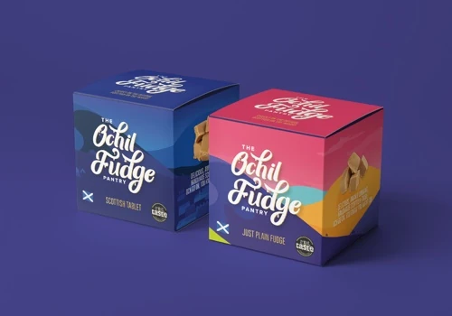
In addition to developing strategies, we also focus on content creation. We handle everything from design and online media production to social media campaigns, print materials, video production, digital illustrations, animations, event management, and research – all conveniently offered in one location! Totalize Media is a comprehensive Marketing and Graphic Design agency located in Glasgow. Our passion for food and drink drives our expertise in marketing within that industry.
Tech Stack
Oracle Application Development FrameworkSpring MVCSymfonyVueJSZend PHPStruts
Languages Spoken
English
HIGHLIGHTS
$5,000+
Min Project Size
$50 - $99/hr
Avg Hourly Rate
2 - 9
Employees
2016
Year Founded
Services
Focus
Industries
Clients
Services Provided
14% Graphic Design
20% Brand Identity Design
33% Print Design
10% Marketing Analytics & Reporting
23% Other Digital Marketing
Projects & Clients
Project Size & Rate
Minimum Project Size
$5,000+
Average Hourly Rate
$50 - $99/hr
Locations
Headquarters
Suite 203, 1 Ainslie Road, HILLINGTON
Glasgow, Scotland, United Kingdom G52 4RU