Tarasenko Agency
Profile set up by Edverise AISet Up By Edverise AI
Edverise AI built this profile by analyzing thousands of data points across the web. If you own this business, become an Edverise partner to manage and update your profile.
Overview
$5,000+
Min Project Size
$100 - $149/hr
Avg Hourly Rate
10 - 49
Employees
2020
Year Founded
ABOUT TARASENKO AGENCY
Design & Strategy Agency
We build brands that resonate with customers, instill pride in employees, and spark envy among competitors. Our team crafts strategies, visual identities, and digital solutions that meet contemporary global standards. Key Service Packages Additional Services
Languages Spoken
EnglishUkrainian
HIGHLIGHTS
$5,000+
Min Project Size
$100 - $149/hr
Avg Hourly Rate
10 - 49
Employees
2020
Year Founded
Services
Focus
Industries
Clients
Services Provided+3 Services
15% Brand Identity Design
13% Logo Design
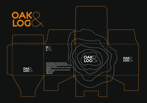
5% Packaging Design
5% Corporate Stationery Design
8% Brand Refresh & Rebranding
5% Graphic Design
18% Product UX Strategy
12% Web App UI Design
About the Team
OUR STORY
Founded in Kyiv in early 2020, Tarasenko is a boutique branding agency dedicated to transforming bold founders' big ideas into beloved brands admired by customers and envied by competitors worldwide. With a focused team of 12 members across two locations, they have successfully delivered over 50 projects spanning nine industries, including beauty, logistics, energy, and startups. Despite challenges posed by the Russian invasion of Ukraine in 2022, their resilient Ukrainian team continues to ensure top-quality delivery while supporting their country by donating 5% of each project's proceeds to prominent Ukrainian funds. Renowned for their creative expertise and consistent results, Tarasenko remains committed to building modern, profitable brands globally.
Projects & Clients
Project Size & Rate
Minimum Project Size
$5,000+
Average Hourly Rate
$100 - $149/hr
Locations
Headquarters
1a Sportyvna Square
Kyiv, Ukraine 01023