GrowPixel LLC
For GrowPixel LLC
Is this your company?
Edverise AI compiled this profile from public information so buyers could find you. Claim it to edit every field, add your portfolio and respond to reviews.
Claim & verify for free
Manage the listing yourself. Verify by work email or company domain to earn the verified badge.
Suggest an edit
Not ready to claim? Send a correction and our team will review and update verified factual errors.
Overview
$1,000+
Min Project Size
$25 - $49/hr
Avg Hourly Rate
10 - 49
Employees
2020
Year Founded
ABOUT GROWPIXEL LLC
We design and Develop Digital Experiences
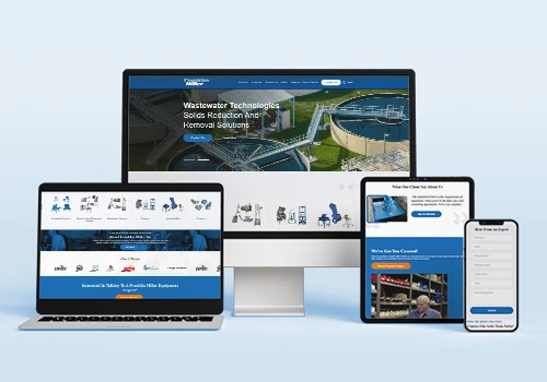
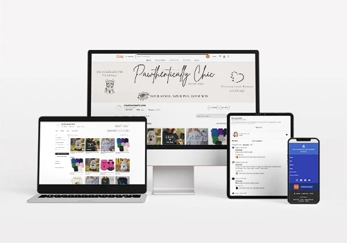
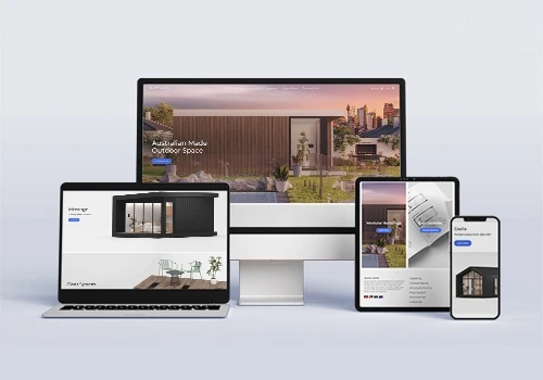
Growpixel is a dynamic design and development agency focused on aiding brands in turning concepts into impactful digital experiences. With expertise in contemporary design, user-friendly interfaces, and seamless development, Growpixel merges visual appeal with functionality to create impressive websites, applications, and digital solutions that yield results. Catering to both startups and established companies, Growpixel collaborates with clients to design customized digital products that enhance their visibility and engage their audiences. From branding and UI/UX design to web development and comprehensive product launches, the Growpixel team brings together innovation, strategy, and technical know-how to realize every vision. Key Services include: UI/UX Design, Web Design & Development, E-commerce Solutions, Custom Web Applications, and Branding & Identity. Fueled by creativity and precision, Growpixel is your ideal partner for creating meaningful digital experiences that evolve alongside your business.
Tech Stack
Amazon Application Development FrameworkGoogle app engineAzure PlatformReactJavaJavaScript
Languages Spoken
English
HIGHLIGHTS
$1,000+
Min Project Size
$25 - $49/hr
Avg Hourly Rate
10 - 49
Employees
2020
Year Founded
Services
Focus
Industries
Clients
Services Provided+1 Services
15% Custom Web Application Development
10% E-Commerce Development
10% Product UX Strategy
8% Mobile App UI Design
8% Web App UI Design
25% Brand Identity Design
12% Search Engine Optimization (SEO)
6% Other Digital Marketing
About the Team
OUR STORY
Our Journey At Grow Pixel Agency, we support U.S. businesses through outstanding web design, branding, SEO, and digital marketing services. Our goal is to provide innovative, results-oriented solutions that enhance growth and engagement. We prioritize creativity, transparency, teamwork, and integrity, customizing each project to ensure tangible success while fostering long-term trust with our clients. Our emphasis is on assisting startups and emerging brands in enhancing their online presence.
Projects & Clients
Project Size & Rate
Minimum Project Size
$1,000+
Average Hourly Rate
$25 - $49/hr
Locations
Headquarters
300 North Sam Houston Parkway East
Houston, Texas, United States 77060