Curves n' Colors Pvt. Ltd.
Profile set up by Edverise AISet Up By Edverise AI
Edverise AI built this profile by analyzing thousands of data points across the web. If you own this business, become an Edverise partner to manage and update your profile.
Overview
$5,000+
Min Project Size
$25 - $49/hr
Avg Hourly Rate
50 - 249
Employees
2004
Year Founded
ABOUT CURVES N' COLORS PVT. LTD.
Tech. Design. Art.
Curves n’ Colors is a unique creative group that operates at the intersection of technology, design, and art. We aim to discover innovative technological pathways to develop and design modern solutions tailored specifically for various businesses.
Tech Stack
PHPSQLJavaScriptLaravelFlutterVueJS
Languages Spoken
English
HIGHLIGHTS
$5,000+
Min Project Size
$25 - $49/hr
Avg Hourly Rate
50 - 249
Employees
2004
Year Founded
Services
Focus
Industries
Clients
Services Provided
20% Custom Web Application Development
14% Mobile App Development (iOS & Android)
17% Product UX Strategy
8% Mobile App UI Design
8% Web App UI Design
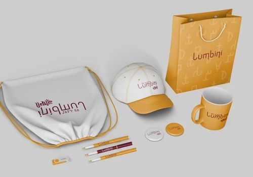
33% Brand Identity Design
About the Team
OUR STORY
Curves n’ Colors is a pioneering creative IT company based in Kathmandu, dedicated to crafting innovative digital solutions for modern enterprises. With a design-focused approach, our team of passionate creators nurtures every project from initial concept through launch. Our leadership team, combining over 90 years of experience, brings diverse expertise, having roots in Kamana Publication and a shared vision to digitize and revitalize traditional art. Established as one of Nepal's oldest design studios, we operate at the intersection of art, design, and technology, striving to be a leading IT solutions provider. We value collaboration, welcoming driven individuals to join us in exploring the evolving landscape of creativity and technology.
Projects & Clients
Project Size & Rate
Minimum Project Size
$5,000+
Average Hourly Rate
$25 - $49/hr