Brllnt
Profile set up by Edverise AISet Up By Edverise AI
Edverise AI built this profile by analyzing thousands of data points across the web. If you own this business, become an Edverise partner to manage and update your profile.
Overview
$5,000+
Min Project Size
$50 - $99/hr
Avg Hourly Rate
2 - 9
Employees
2014
Year Founded
ABOUT BRLLNT
Spark greater impact through design
Brand equity drives impact and profits. Consumers appreciate brands that resonate with their values, and outstanding experiences motivate fans to promote your brand on your behalf, eliminating the need for manipulative marketing strategies. We believe that the brilliance already exists in the minds of those we collaborate with—our job is to transform those ideas into long-lasting brands. Our services include: Brand Roadmap: outlining your goals and the steps to achieve them, Brand Launch: introducing your brand to the market, Brand Building: maintaining engaging content across your channels, and Brand Growth: enhancing visibility through campaigns and partnerships.
LANGUAGES SPOKEN
English
HIGHLIGHTS
$5,000+
Min Project Size
$50 - $99/hr
Avg Hourly Rate
2 - 9
Employees
2014
Year Founded
Services
Focus
Industries
Clients
Services Provided
100% Brand Identity Design
40% UX Research & Usability Testing
40% Product UX Strategy
20% Web App UI Design
100% Social Media Marketing
About the Team
OUR STORY
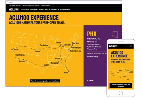
Brllnt is a collaborative network of creative leaders founded in 2014 by Mel, who brings over a decade of expertise leading design teams and advising clients like the ACLU and George Washington University. Rooted in the belief that design can tackle the world's toughest challenges, Brllnt focuses on turning visionary ideas into sustainable success that benefits society. Mel's background includes work with major organizations such as the Bill & Melinda Gates Foundation and serving on AIGA-DC's board. The agency takes a values-driven approach, connecting businesses and customers on a human level, recognizing that alignment of beliefs drives consumer support. Brllnt continues to innovate, aiming to enhance transparency and protection in design through smart contracts, reflecting their commitment to ethical and impactful creative solutions.
Projects & Clients
Project Size & Rate
Minimum Project Size
$5,000+
Average Hourly Rate
$50 - $99/hr
Locations
Headquarters
1140 3rd St NE, Suite 375