Kallamuz
**THE CHALLENGE** Kallamuz is a gifting company that specializes in solutions for both private and commercial events. Its name, “Kallamuz,” is inspired by the term "calamus," which comes from the Greek word "kalamos," referring to a reed known for its decorative and therapeutic qualities, as it emits fragrance when broken and is easy to cultivate. The company offers a diverse array of gift boxes, floral arrangements for any occasion, and party decorations, engaging four of the five human senses: touch, sight, smell, and hearing. In addition to selling flowers, Kallamuz produces its own spa products, including candles, soaps, essences, and salts, and provides training for decorators. The challenge was to design a symbol that encapsulates the meaning of the company's name and vision, select appropriate typography based on our concept, and develop supportive graphic elements and materials that complement the visual identity.
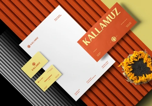
**THE SOLUTION** The responsive logo, featuring a blooming calamus, was designed using a grid, allowing the isotype to be used in various contexts, either alongside the logotype or independently. While brown and yellow are the main colors, the pastel palette enables the brand to be adaptable with various colors suited to different seasons, events, or target audiences. The uppercase typography ensures readability while suggesting the brand's quality, elegance, and premium characteristics.
**BRAND IDENTITY** The goal of the project was to highlight the company's unique qualities through its visual identity design. Personalization is central to the brand, and pastel colors were chosen to create a flexible visual identity that meets customer needs. It also allows for growth and the integration of new ideas, products, and services. The Kallamuz identity promotes an image of a classic and timeless brand that maintains a balance between seriousness and playfulness, as well as directness and depth.