Studio Zak
For Studio Zak
Is this your company?
Edverise AI compiled this profile from public information so buyers could find you. Claim it to edit every field, add your portfolio and respond to reviews.
Claim & verify for free
Manage the listing yourself. Verify by work email or company domain to earn the verified badge.
Suggest an edit
Not ready to claim? Send a correction and our team will review and update verified factual errors.
Overview
$5,000+
Min Project Size
2 - 9
Employees
2007
Year Founded
ABOUT STUDIO ZAK
Design Italiano
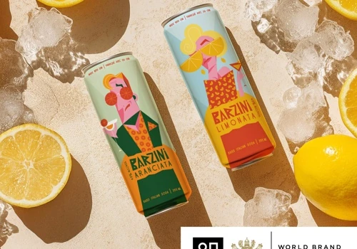
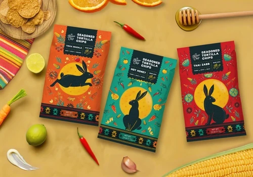
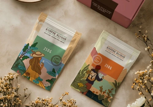
Hello! We are Studio Zak, a celebrated studio specializing in branding, packaging, and surface design, merging creativity with strategic thinking to create effective designs. Our mission is to turn visions into reality through design.
Since 2007, we've been assisting brands in their launch and growth endeavors. We are well-versed in packaging regulations (FDA, EFSA, SFDA, and others), printing techniques, and impactful marketing strategies, guiding projects from concept to shelf.
It all begins with a simple greeting—let's take your brand to the next level.
Languages Spoken
EnglishItalian
HIGHLIGHTS
$5,000+
Min Project Size
2 - 9
Employees
2007
Year Founded
Services
Focus
Industries
Clients
Services Provided
20% Brand Identity Design
13% Logo Design
17% Packaging Design
50% Print Design
About the Team
OUR STORY
Studio Zak is a globally recognized branding and packaging design studio led by Paula Pozza, operating remotely from Italy and Brazil. They specialize in crafting expressive brand identities and packaging systems that are rooted in strategy and storytelling, tailored to help clients stand out and grow in diverse markets. Their unique "Hey Method" prioritizes brand positioning and narrative, guiding each creative phase from discovery through growth. With nearly two decades of international experience, Paula and her team merge artistic vision with strategic insight, emphasizing hand-drawn, whimsical designs full of personality. Committed to learning and sharing, they offer talks and workshops on topics like packaging effectiveness and consumer trends. Their work has earned client praise for exceeding expectations and delivering professional, impactful designs.
Projects & Clients
Project Size & Rate
Minimum Project Size
$5,000+
Locations
Headquarters
Via Gaspare Gozzi
Rome, Lazio, Italy 00145