PixelBranded.Co
For PixelBranded.Co
Is this your company?
Edverise AI compiled this profile from public information so buyers could find you. Claim it to edit every field, add your portfolio and respond to reviews.
Claim & verify for free
Manage the listing yourself. Verify by work email or company domain to earn the verified badge.
Suggest an edit
Not ready to claim? Send a correction and our team will review and update verified factual errors.
Overview
$5,000+
Min Project Size
$50 - $99/hr
Avg Hourly Rate
2 - 9
Employees
2012
Year Founded
ABOUT PIXELBRANDED.CO
Your Vision, Branded. Beautifully.
We are a Graphic Design and Branding Agency dedicated to delivering exceptional results for our clients. Our comprehensive range of creative design services is designed to help your business stand out. From logo creation to web design, SEO, and branding services, we’ve got your needs covered. We recognize the importance of crafting a unified brand identity that resonates with your audience. That’s why we collaborate closely with our clients to understand their specific needs and provide custom solutions that go above and beyond their expectations. With our extensive experience, we stay on top of design trends and utilize the latest tools and techniques to keep your brand vibrant and relevant. Whether you want to refresh your existing branding or build a new one from the ground up, we have the expertise to turn your vision into reality. We believe in the impact of great design to convey your message effectively while making a lasting impression on your audience. In today’s competitive landscape, leaving a memorable mark on potential customers is crucial, and we are here to help you do just that. So why delay? Reach out to us today, and let’s elevate your brand together! Together, we can create something exceptional that distinguishes you from the competition.
Tech Stack
WordPressAdobe Experience Manager CMSShopify SEO
Languages Spoken
English
HIGHLIGHTS
$5,000+
Min Project Size
$50 - $99/hr
Avg Hourly Rate
2 - 9
Employees
2012
Year Founded
Services
Focus
Industries
Clients
Services Provided
13% Brand Identity Design
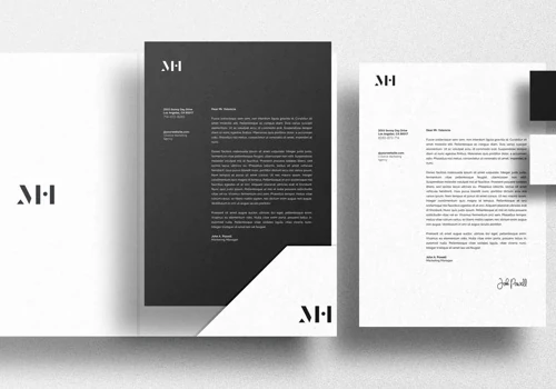
5% Corporate Stationery Design
5% Pitch Deck & Presentation Design
7% Marketing Collateral Design
3% Packaging Design
17% Product UX Strategy
17% UX Research & Usability Testing
33% Search Engine Optimization (SEO)
Projects & Clients
Project Size & Rate
Minimum Project Size
$5,000+
Average Hourly Rate
$50 - $99/hr