Overmatter
For Overmatter
Is this your company?
Edverise AI compiled this profile from public information so buyers could find you. Claim it to edit every field, add your portfolio and respond to reviews.
Claim & verify for free
Manage the listing yourself. Verify by work email or company domain to earn the verified badge.
Suggest an edit
Not ready to claim? Send a correction and our team will review and update verified factual errors.
Overview
$10,000+
Min Project Size
150+
Avg Hourly Rate
2 - 9
Employees
2024
Year Founded
ABOUT OVERMATTER
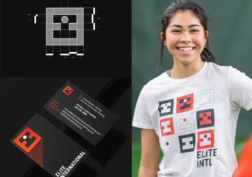
Logos, Brand Identities, and Websites of Influence
Accelerating the Growth of Entrepreneurs, Companies, and Cultural Organizations. Creating systems that effectively attract the right clients, generate leads and sales directly to your inbox, and provide a clear, manageable strategy for achieving your next revenue goal—all while enhancing your growth without increasing your workload, by focusing on clarity, consistency, and trustworthiness. Assisting entrepreneurs and organizations in evolving their businesses into brands that drive growth. By using strategy, identity, and high-performance websites, the Brand Multiplier Effect™ transforms clarity into return on investment and establishes scalable systems. ✶ Schedule a Free 30-Minute Brand Calibration Call to discover:
Languages Spoken
English
HIGHLIGHTS
$10,000+
Min Project Size
150+
Avg Hourly Rate
2 - 9
Employees
2024
Year Founded
Services
Focus
Industries
Clients
Services Provided
25% Brand Identity Design
20% Logo Design
5% Graphic Design
30% Web App UI Design
20% Product Design
About the Team
OUR STORY
At Overmatter, we believe images have the power to shape culture by transforming complexity into clarity and making aesthetics widely accessible. Our integrated approach combines physical and digital techniques to craft impactful brand identities, editorial pieces, environmental graphics, and communication strategies. Kaleb, the driving force behind our brand design, emphasizes the transformative power of identity through thoughtful typographic and design explorations that enrich experiences. With a background in teaching Typography and Interaction Design, and previous work with prominent clients such as BMW and Caterpillar, Kaleb brings depth and expertise to every project. Recognized internationally and featured in esteemed design collections, Kaleb's journey from a design-scarce rural Idaho to the vibrant Chicago scene fuels his commitment to fostering community and giving
Projects & Clients
Project Size & Rate
Minimum Project Size
$10,000+
Average Hourly Rate
150+