The Modern World
Profile set up by Edverise AISet Up By Edverise AI
Edverise AI built this profile by analyzing thousands of data points across the web. If you own this business, become an Edverise partner to manage and update your profile.
Overview
$10,000+
Min Project Size
2 - 9
Employees
2017
Year Founded
ABOUT THE MODERN WORLD
Make brands mean more.
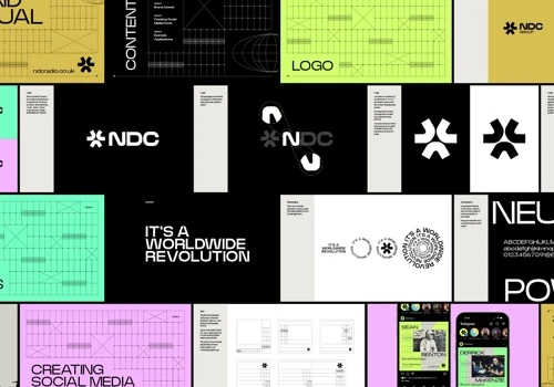
The Modern World is a branding agency focused on developing brands for small and medium-sized enterprises in the health and wellness, sports and recreation, music, and hospitality sectors. Our services include brand strategy and design, employing a distinctive approach that rethinks the creative process we engage in with our clients. This method is faster than conventional agency techniques while maintaining high quality. It fosters collaboration without consuming excessive time and mental resources, and effectively addresses the key challenges that guide each business toward realizing its vision. Our projects typically result in growth—whether financial, by creating appealing content that draws in the right customers; through establishing a culture that attracts top talent; by increasing market share with exceptional industry positioning; or by achieving all these objectives together. We frequently help clients save significantly on ineffective marketing efforts that lack substance and fail to resonate with their audience by crafting meaningful brands.
Languages Spoken
English
HIGHLIGHTS
$10,000+
Min Project Size
2 - 9
Employees
2017
Year Founded
Services
Focus
Industries
Clients
Services Provided
20% Brand Identity Design
10% Graphic Design
8% Marketing Collateral Design
7% Corporate Stationery Design
5% Packaging Design
35% Print Design
15% Out of Home Design
About the Team
OUR STORY
Warrington Brand Studio collaborates with founders of growing consumer lifestyle brands, focusing on building authentic brands from within by igniting purpose, shaping culture, and crafting unique brand experiences. Frustrated by traditional agency methods marked by lengthy processes and disengagement, the studio reinvented its approach after introspection and hiring external consultants. This led to a lean, collaborative process inspired by tech product development, emphasizing purpose-driven, iterative creation. Their goal is to empower founders by producing distinct brands that command market recognition, foster deeper connections, and drive growth—not just appealing aesthetics. Committed to impactful work, the studio supports DKMS, the UK’s largest stem cell donor register, reflecting their dedication to meaningful partnerships that make a real difference beyond branding.
Projects & Clients
Project Size & Rate
Minimum Project Size
$10,000+
Locations
Headquarters
The Outset, Office 2A, Sankey Street
Warrington, Cheshire, United Kingdom WA1 1NN