BroHouse
Profile set up by Edverise AISet Up By Edverise AI
Edverise AI built this profile by analyzing thousands of data points across the web. If you own this business, become an Edverise partner to manage and update your profile.
Overview
$10,000+
Min Project Size
$50 - $99/hr
Avg Hourly Rate
2 - 9
Employees
2013
Year Founded
ABOUT BROHOUSE
Bold branding for visionary businesses
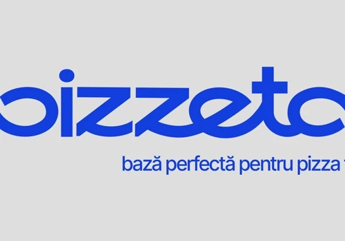
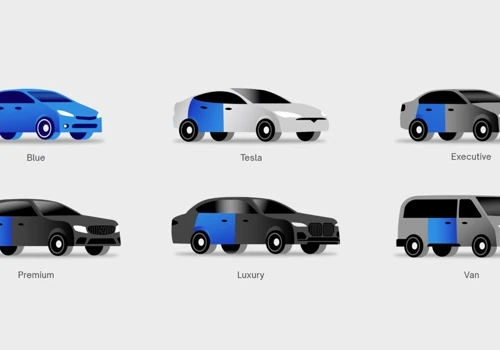
At BroHouse agency, we view branding as more than just a logo; it's a story conveyed visually and strategically. For over ten years, we've assisted brands in Romania and throughout Europe in clarifying their mission, articulating their voice, and showcasing their identity through unique brand strategies, visual identity systems, and packaging design. We collaborate with driven companies that aim to create brands that are genuine, relevant, and hard to overlook. Our efforts have garnered significant international recognition, including: 🏆 Gold Winner at Transform Awards Europe 2025 (Best Visual Identity | Transport Sector) 🥉 Bronze Winner at Pentawards 2022 (Packaging Design | Pet Products) 🥉 Bronze Winner at Pentawards 2020 (Packaging Design | Food Trends) Our areas of expertise include: ⚙️ Service Focus Service 🧳 Featured Work 1️⃣ Pizzeta | Branding & Packaging for a Contemporary Italian Pizzeria 2️⃣ Blue | Branding for a Ride-Sharing App 🏆 Awarded Gold at Transform Awards Europe 2025 3️⃣ Crida Pharm | Branding for a Pharmaceutical Company 🥉 Awarded Bronze at Pentawards 2022 4️⃣ SanoVita | Packaging Design for Food Trends 🥉 Awarded Bronze at Pentawards 2020
LANGUAGES SPOKEN
English
HIGHLIGHTS
$10,000+
Min Project Size
$50 - $99/hr
Avg Hourly Rate
2 - 9
Employees
2013
Year Founded
Services
Focus
Industries
Clients
Services Provided
50% Brand Identity Design
40% Packaging Design
10% Graphic Design
40% Product Design
30% UX Research & Usability Testing
30% Product UX Strategy
100% Generative AI
About the Team
OUR STORY
BroHouse was founded by twin brothers Costin and Horia Oane, who believe their shared experiences have shaped their approach to life and business. Both graduates of Nottingham Trent University, the brothers view branding as a lifelong pursuit, dedicating their talents to crafting unique visual identities that genuinely represent companies and the people behind them. As a close-knit team, BroHouse balances professionalism with a familial work ethos, reflected in their award-winning branding and web design recognized on platforms such as DesignRush and Clutch. Their expert team, including designers and developers, collaborates to transform client visions into compelling brand stories, emphasizing authenticity, strategic design, and seamless digital experiences.
Projects & Clients
Project Size & Rate
Minimum Project Size
$10,000+
Average Hourly Rate
$50 - $99/hr