BEXBRANDS
Profile set up by Edverise AISet Up By Edverise AI
Edverise AI built this profile by analyzing thousands of data points across the web. If you own this business, become an Edverise partner to manage and update your profile.
Overview
$25,000+
Min Project Size
$50 - $99/hr
Avg Hourly Rate
2 - 9
Employees
2010
Year Founded
ABOUT BEXBRANDS
Give a Shift
Enjoy yourself. Create Great Work. Design for Transformation. At Bex, we’re shaping the future we envision. We collaborate with forward-thinking brands that proudly embrace sustainability and highlight their unique approaches. We assist you in discovering your voice, selecting your colors, displaying your identity, and pushing you to be your most authentic self. It turns out that this authenticity is often remarkable and incredibly rare. We are passionate artists focused on functionality and driven by innovative design. We strive to deliver on schedule, surpass expectations, and provide you with insights you didn’t realize you were seeking. Making your impact is how we make ours, so let’s initiate some change together.
LANGUAGES SPOKEN
English
HIGHLIGHTS
$25,000+
Min Project Size
$50 - $99/hr
Avg Hourly Rate
2 - 9
Employees
2010
Year Founded
Services
Focus
Industries
Clients
Services Provided
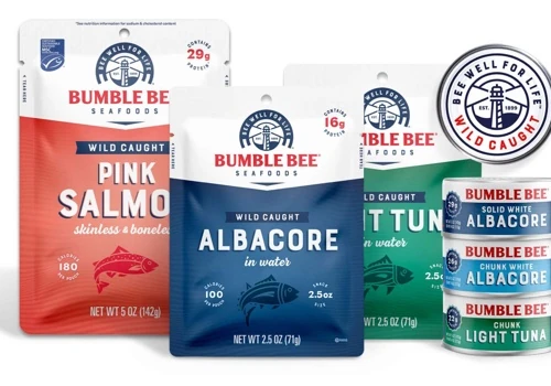
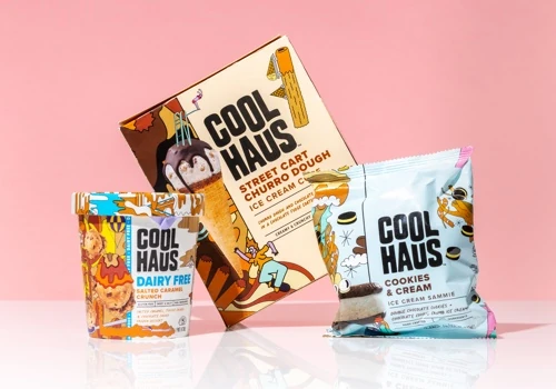
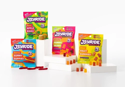
25% Packaging Design
45% Brand Identity Design
20% Logo Design
10% Graphic Design
100% Print Design
Projects & Clients
Project Size & Rate
Minimum Project Size
$25,000+
Average Hourly Rate
$50 - $99/hr